
Repositioning All Things Picnic’s services and offerings
PROJECT DETAILS
Product Designer
Febuary - April 2026 (10 weeks)
The Brief
Customers were unaware of the breadth of services provided by All Things Picnic (ATP), often assuming they only specialise in couples picnic setups and romantic proposals.
Collaborating with ATP, I took on the task of designing and establishing a Services page that showcased their full range of offerings, from corporate event planning to bespoke wedding styling.
By carrying out user research and testing the intuitive interface, we highlighted ATP’s unique offerings, ensuring that their customers could effortlessly explore and appreciate their services.
What I Did
User research
Competitor research
UX/UI design (Mobile/desktop)
Wireframes
Prototyping
How did I have an impact?
I conducted in-depth interviews with a diverse group of customers who had previously interacted with the All Things Picnic (ATP) website. These conversations revealed a consistent theme: while the brand was visually charming and memorable, most users didn’t fully understand the scope of what ATP offered.
“I thought they only offered couples picnics and proposal set ups.”
“The services are scattered all over the website making it confusing.”
“To be honest, the name doesn’t really reflect everything they do – it’s a bit misleading.”
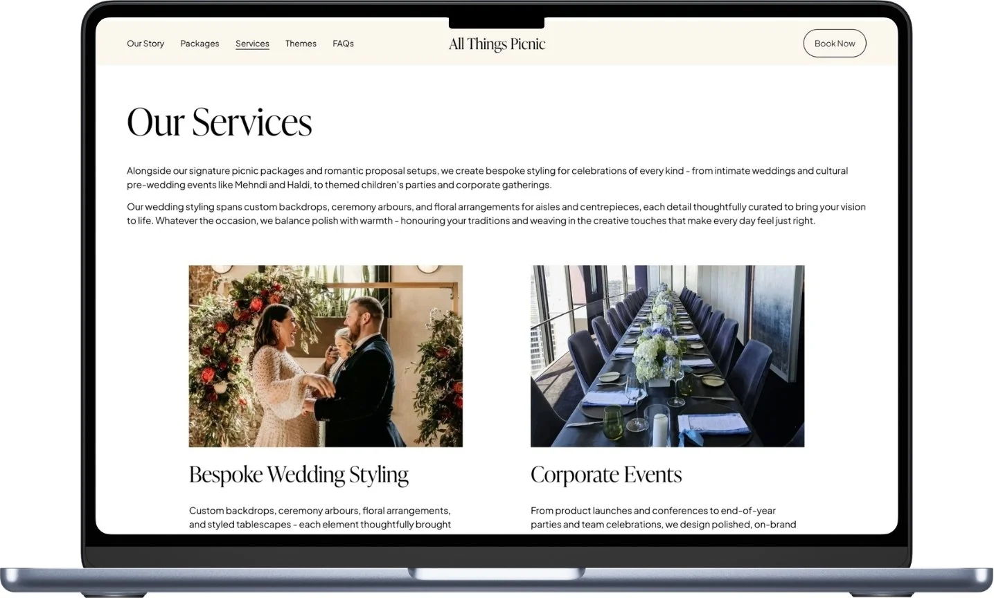
It became clear that the existing website wasn’t telling the full story and as a result, ATP wasn’t reaching segments of their audience who could benefit from their broader services. Armed with this insight, I led the creation of a dedicated Services page that brought clarity and structure to ATP’s offerings — from bespoke wedding styling and intimate cultural gatherings to large-scale corporate events. The design focused on usability and simplicity, giving users a seamless way to explore everything the brand had to offer.
Through research-driven design and thoughtful UX, we helped reposition ATP as more than just a picnic company. The result was a clearer, more cohesive services page that empowered users to discover the brand’s breadth and gave ATP the space to reach customers in previously untapped markets.
Low Fidelity Wireframes
Option 1: Scroll-based layout
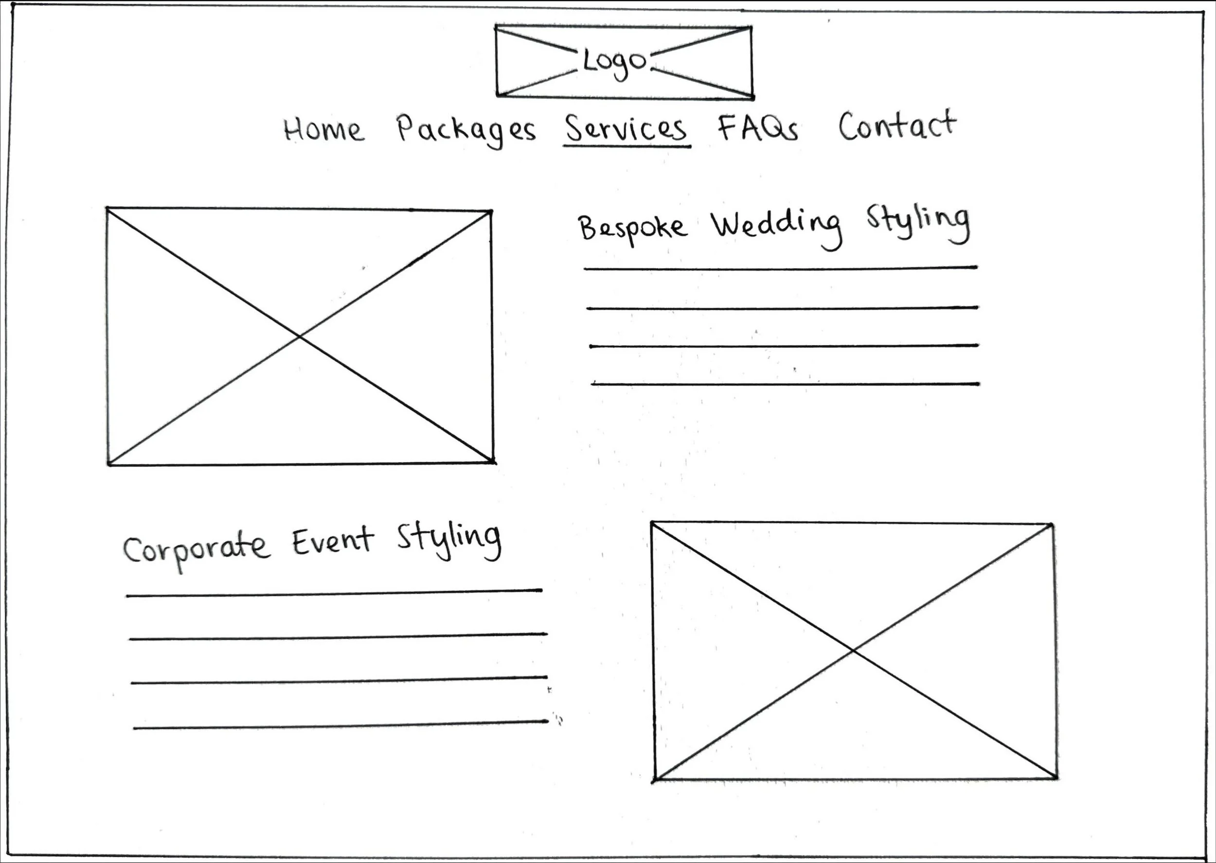
The scroll-based layout presents services in a vertical scrolling format, allowing users to view detailed descriptions and larger images for each service one at a time. It provides a more immersive experience with plenty of space for visuals and text, making it ideal for users who want to explore each service in depth.
Option 2: Card-based grid layout
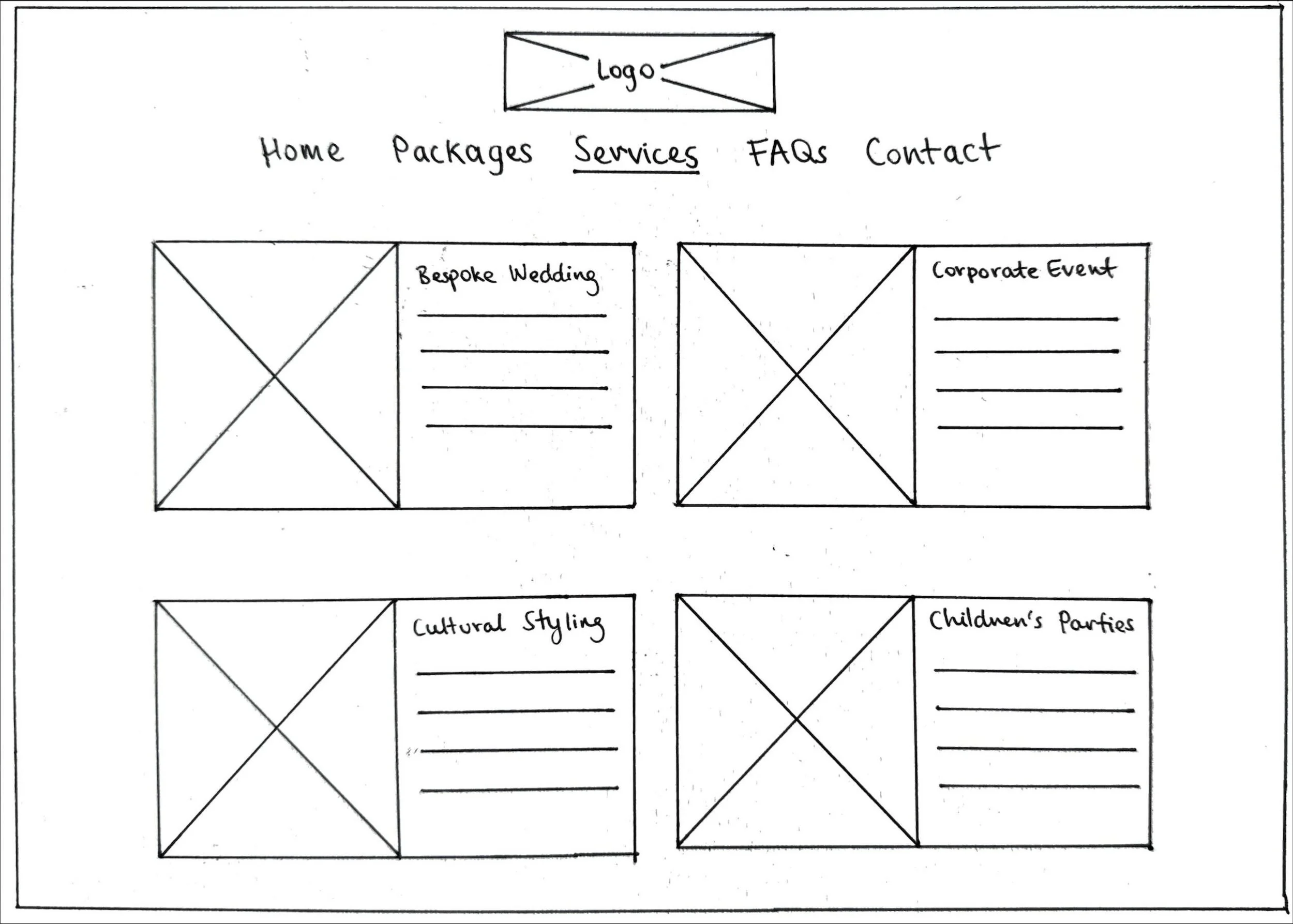
This card-based layout displays all services on a single page using a grid design. Each service is presented in its own card with a thumbnail image and brief description, enabling users to quickly see all available services at a glance. This design is compact, user-friendly, and ideal for faster browsing.
ATP selected the card-based layout to provide users with an clear, instant view of all available services, eliminating the need to scroll and making it easier for users to quickly grasp the full scope of offerings at a glance.
Results
The Services page launched in April 2026. The impact:
18% increase in average time spent on the site over the first 2 months
2x more enquiries for services beyond standard picnic packages
25% uplift in booking conversions for wedding and corporate events
Positive qualitative feedback from clients citing improved clarity and discovery of services
Clearer user navigation and reduced drop-off from the Contact Us page